
Goungyeol theme (beauty store)
Goungyeol theme (beauty store)
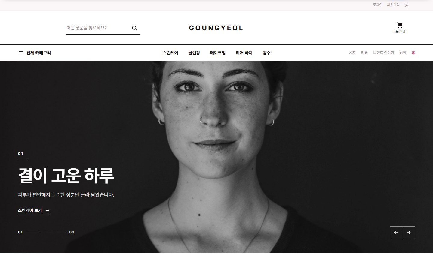
This is the manual for Goungyeol (goungyeol), the official Zittme theme for cosmetics and beauty stores. Like a beauty select shop, it leaves generous white space and shows large product photos on square-cornered cards, with a rose fuchsia accent and blush ivory tones. It uses the same foundation as the Sinsunhan theme (built-in theme home page, sections assembled with repeat fields), so for anything not covered here, see the Sinsunhan theme document as well.
Demo: shopdemo2.zitt.me
Components
| Component | Location | Role |
|---|---|---|
| Layout | themes/goungyeol/layouts/goungyeol | Site frame + built-in theme home page |
| Commerce skin | themes/goungyeol/modules/commerce | Shop home, list, detail, cart, order, My shopping, promotions |
| Board skin | themes/goungyeol/modules/board | List, card, webzine, and FAQ styles |
| Member, message, notification center, and system message skins | themes/goungyeol/modules/{member, communication, ncenterlite, message} | Login, My page, messages, notifications, system notices |
| Reservation, zittme Pay, Contact, and Knowledge Q&A skins | themes/goungyeol/modules/{reservation, zittme_pay, contact, kin} | Applied only on sites where those modules are installed |
Installing and applying
- Install it from the store, or unzip it into
themes/goungyeol. - In Admin > Design settings, choose Goungyeol and apply it.
- If the Commerce module is installed, the store menu, header search, and home page product sections connect automatically. If you have several shop modules, enter the mid in Layout settings > Main composition > "Shop module address (mid)".
- Brand line: The product's summary field appears as the brand line on cards and the detail page. If you enter just the brand name briefly in the summary, you get a two-line "Brand / Product name" display like a select shop. (The Streetlab theme differs: it splits on
/inside the product name.) - Star rating and review count: Cards also show the average rating and number of reviews from Commerce product reviews. Products without reviews don't show them.
- Ranking numbers and sale badges: The ranking section overlays rank numbers, and discounted products overlay a discount-rate badge, on the card.
- In Layout settings > First screen > Visual slides, register one more slide filled with a photo, title, description, and button. (To keep it out of the slider, put the slide later in the order and adjust the count in "Visual slider display".)
- Add "Editorial" to the home page sections and enter that slide number as the source.
- If you leave the section title empty, the default title appears; if you enter one, that text appears as a small label.
- List: Category tabs, search, sorting. Cards show the brand line (summary), star rating, and sale badge.
- Detail: Brand line, product name, price, points, shipping fee, options, Buy now, cart. "Additional information" from product management appears as a table below the summary.
- Promotions, cart, order, and My shopping: The same flow as the Sinsunhan theme, and payment continues in the zittme Pay skin.
Recommended: Zittme 1.0.1 or later, Commerce 0.2.16 or later. Since this is a responsive theme, we recommend turning off the mobile-only view.
Brand line, star ratings, and rankings on product cards
Built-in theme home page (Main composition)
Build it in order with the "Home page sections" repeat field on the Layout settings > Main composition tab. If there are none, the default composition is used.
| Section type | Content | Source (source) | Count (count) |
|---|---|---|---|
| Shop category tiles | Shortcuts to top-level categories. Icons come from the "Category icons" repeat field | - | Number of tiles |
| Recommended / New / Sale / Popular products | Product card grid | - | Number of products |
| Deal of the day | One of the top-discount products rotates each day | - | - |
| Active promotion cards | Commerce promotions as image cards | - | Number of cards |
| Real-time popularity ranking | Ranks 1 to N by purchases, then views | - | Number of ranks |
| Banner band | Reuses a visual slide image as a mid-page banner | Slide number | - |
| Editorial | One photo cell + one text cell. Uses the visual slide's image, title, description, and button as is | Slide number (1 if empty) | - |
| Latest board posts | List of board posts. Enter several mids separated by commas for multiple columns | Board mid (e.g., notice,board) | Number of posts |
How to build an editorial section
Shop screens (Commerce skin)
Footer
In Layout settings > Footer, fill in the site introduction, customer center phone, business hours, and email, social links, bottom notice text, business and contact information, and the copyright notice.
All layout settings
Basic
Logo image, dark mode logo, logo text, accent color, maximum content width (1060, 1180, 1320), menu bar width, menu bar color, mobile dark mode button position, mobile language selector position, color mode
First screen
Visual slider display, auto-advance interval, visual slides (background image, title, description, button label, button link, text alignment)
Main composition
Category icons, store module address (mid), home page sections (type, title, source, count)
Content and sidebar
Enable integrated search, show login box in sidebar
Footer
Site introduction, customer center phone number, business hours, contact email, four social links, bottom notice text, business and contact information, copyright notice