
Streetlab theme (fashion store)
Streetlab theme (fashion store)
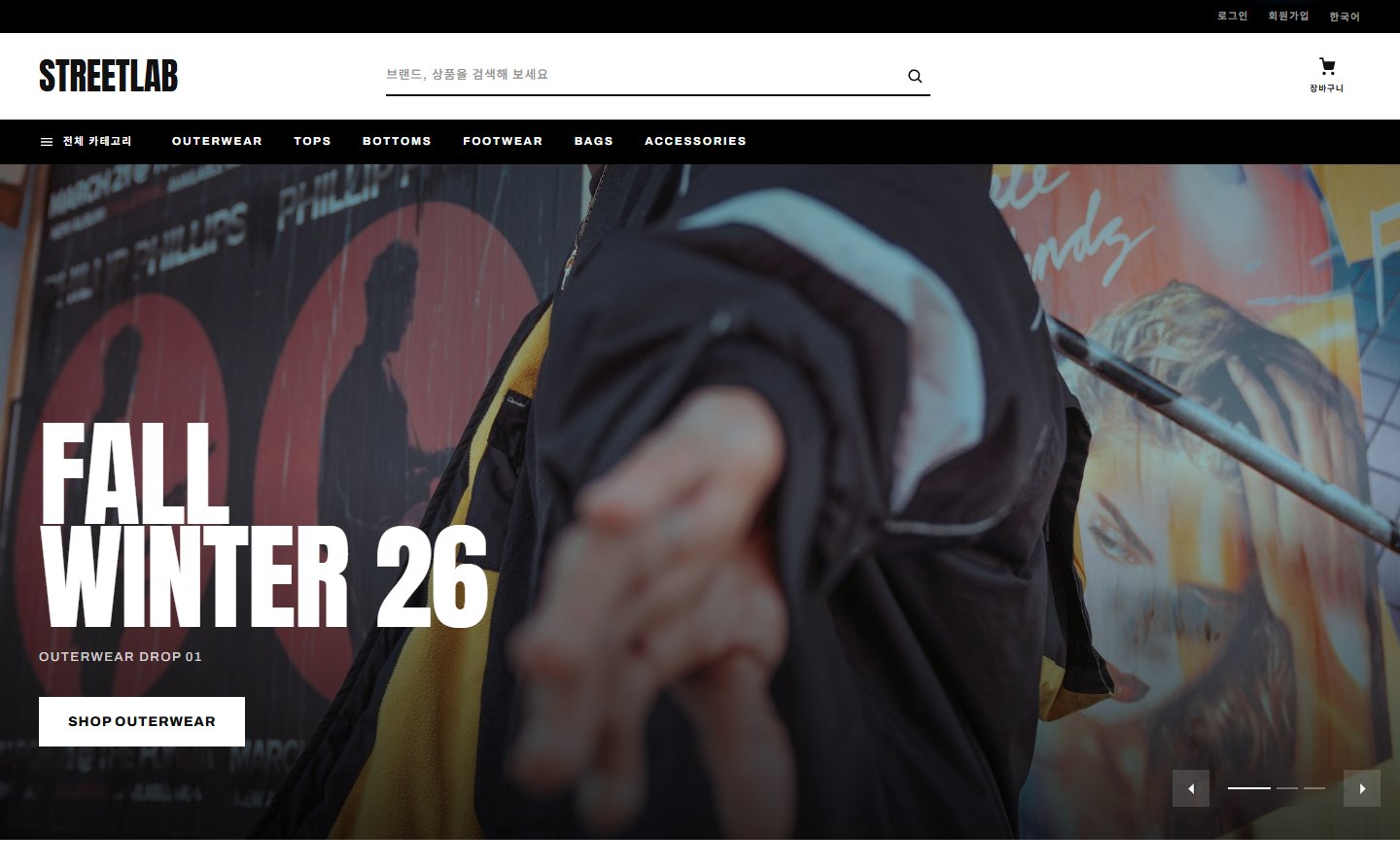
This is the manual for Streetlab (streetlab), the official Zittme theme for fashion and street brand online stores. It uses a monochrome tone of pure white with a single ink black, and product photos take center stage on a front page with ranking tabs and a brand strip. It uses the same skeleton as the Sinsunhan theme (built-in theme main page, sections assembled with a repeat field), so for anything not covered here, also see the Sinsunhan theme document.
Demo: fashiondemo.zitt.me
Components
| Component | Location | Role |
|---|---|---|
| Layout | themes/streetlab/layouts/streetlab | Site skeleton + built-in theme main page |
| Commerce skin | themes/streetlab/modules/commerce | Store home · list · detail · cart · order · my shopping · promotions |
| Board skin | themes/streetlab/modules/board | List · card · webzine · FAQ styles |
| Member · message · notification center · system message skins | themes/streetlab/modules/{member, communication, ncenterlite, message} | Log in · my page · messages · notifications · system notices |
| Reservation · zittme Pay · contact · knowledge Q&A skins | themes/streetlab/modules/{reservation, zittme_pay, contact, kin} | Applied only on sites where the module is installed |
Change the accent color in Layout settings > Basic, and it applies to every screen. The default is ink black.
Installation and applying the theme
- Install from the store or extract the archive into
themes/streetlab. - In Admin > Design settings, choose Streetlab and apply it. The layout and module skins change all at once.
- If the commerce module is present, the store menu, header search, and front-page product sections are connected automatically. If you have several store modules, enter the mid to use in Layout settings > Main composition > "Store module address (mid)".
- Example: If you register the product name as
BLACKLINE / Lambswool Crewneck, list cards, detail, cart, and order lines show BLACKLINE as the brand line and Lambswool Crewneck as the product name. - The separator is a single slash with a space on each side (
/). Without a slash, only the product name appears, with no brand line. - "Additional information" in product management is unrelated to this brand line. Additional information is a separate item shown as a table below the summary on the detail page.
- Search, sorting, and order forms use the full product name (
Brand / Product name) as is. - List: Category tabs · search · sorting (display order · newest · popular · price). Cards show recommended · NEW badges, the brand line, and the discount rate and list price.
- Detail: Brand line · product name · summary · price · points · shipping fee · option selection · buy now · add to cart. "Additional information" from product management appears as a table below the summary.
- Promotions: Draws commerce promotions (
?v=promo&p=slug) with a banner, introduction, and product grid. - Cart · order · payment · my shopping: Same flow as the Sinsunhan theme, and payment continues in the zittme Pay skin.
Recommended: Zittme 1.0.1 or later, commerce 0.2.16 or later. This is a responsive theme, so we recommend turning off the mobile-only view.
Product name convention — brand line
This theme doesn't store a brand separately for each product. Instead, if you write the product name in the form Brand / Product name, the part before the slash is split off as the brand and shown small on the line above, and the part after it is shown large as the product name.
Header
It consists of the logo, top menu, search, my page, cart, and notification bell. Choose the menu bar color (dark · accent · light) and width (content width · 100%) in the layout settings. On mobile it collapses into a drawer menu, and you can set the position of the dark mode button and language selector (inside the drawer · header · footer) separately.
Built-in theme main page (main composition)
The layout draws it itself when the site front page is of the main type. Assemble it in order with the "Main page sections" repeat field in Layout settings > Main composition tab; if there are none, the default composition is used (categories → ranking → new arrivals → brand strip → banner → promotions → recommended → daily deal → banner → sale → latest posts).
| Section type | Content | Source (source) | Count (count) |
|---|---|---|---|
| Store category tiles | Shortcuts to top-level categories. Icons come from the "Category icons" repeat field | - | Number of tiles |
| Recommended / new / sale / popular products | Product card grid. Cards show the brand line · discount rate · list price | - | Number of products |
| Daily deal | One product from the top discount rates rotates each day | - | - |
| Ongoing promotion cards | Commerce promotions as image cards | - | Number of cards |
| Real-time popularity ranking (category tabs) | Ranking list you switch by clicking category tabs | - | Number of ranks |
| Brand strip | Brands registered in the "Brands" repeat field in one row. Shows the logo if there is a logo image, otherwise the name | - | Number of brands |
| Banner strip | Reuses a visual slide image as a mid-page banner | Slide number | - |
| Latest board posts | List of board posts. Enter several mids separated by commas for multiple columns | Board mid (e.g., notice,board) | Number of posts |
Brand strip
Register brand names, logo images, and link addresses in the Brands repeat field in Layout settings > Main composition. The brand strip section on the front page reads this list. It isn't connected to the brand line in product names, so it's a good idea to enter that brand's product list (such as search results) directly as the link address.
The "About the platform" block on the demo front page
The black introduction block (large title + four numbers) near the bottom of the demo site's front page is not a theme section but an HTML widget added by hand to the demo site's front page. The numbers are also typed in by hand. To use the same block, add the markup below as an HTML widget on the front page (widget page), and put the styles in the header script of the layout settings (or the additional HTML header in domain settings).
<section class="sl-editorial">
  <div class="sl-editorial-copy">
    <span class="sl-eyebrow">About the platform</span>
    <h2>Built for<br />brands that<br />move fast</h2>
    <p>소개 문장</p>
  </div>
  <div class="sl-editorial-list">
    <div><strong>12</strong><span>Brands</span></div>
    <div><strong>24</strong><span>Products</span></div>
    <div><strong>6</strong><span>Categories</span></div>
    <div><strong>3</strong><span>Campaigns</span></div>
  </div>
</section>
<style>
.sl-editorial { display: grid; grid-template-columns: minmax(0,1fr) minmax(0,1fr); margin: 0; background: #000; color: #fff; }
.sl-editorial-copy { display: flex; flex-direction: column; justify-content: center; gap: 18px; padding: clamp(36px, 5vw, 76px); }
.sl-editorial-copy .sl-eyebrow { font-size: 10px; font-weight: 800; letter-spacing: .22em; text-transform: uppercase; color: rgba(255,255,255,.45); }
.sl-editorial-copy h2 { margin: 0; font-family: var(--hr-display, inherit); font-size: clamp(32px, 4.4vw, 68px); font-weight: 400; line-height: .92; letter-spacing: -.01em; text-transform: uppercase; color: #fff; }
.sl-editorial-copy p { margin: 0; max-width: 46ch; font-size: 13px; line-height: 1.9; color: rgba(255,255,255,.6); }
.sl-editorial-list { display: grid; grid-template-columns: repeat(2, minmax(0,1fr)); gap: 1px; background: rgba(255,255,255,.16); border-left: 1px solid rgba(255,255,255,.16); }
.sl-editorial-list div { display: flex; flex-direction: column; justify-content: flex-end; gap: 8px; min-height: 190px; padding: 24px; background: #000; }
.sl-editorial-list strong { font-family: var(--hr-display, inherit); font-size: 34px; font-weight: 400; line-height: 1; color: #fff; }
.sl-editorial-list span { font-size: 10.5px; font-weight: 700; letter-spacing: .18em; text-transform: uppercase; color: rgba(255,255,255,.45); }
@media (max-width: 860px) { .sl-editorial { grid-template-columns: minmax(0,1fr); } .sl-editorial-list { border-left: 0; border-top: 1px solid rgba(255,255,255,.16); } }
</style>Store screens (commerce skin)
Footer
In Layout settings > Footer, fill in the site introduction, customer service phone · hours · email, social media addresses (Instagram · Facebook · YouTube · blog), bottom notice text, business · contact information, and copyright notice. Enter legal notices such as the mail-order business registration number in "Business · contact information".
All layout settings
Basic
Logo image · dark mode logo · logo text · accent color · maximum content width (1060 · 1180 · 1320) · menu bar width · menu bar color · mobile dark mode button position · mobile language selector position · color mode (device setting · always light · always dark)
First screen
Visual slider display (main only · also on subpages · off) · auto-advance interval · visual slides (background image · title · description · button label · button link)
Main composition
Category icons · brands · store module address (mid) · main page sections (type · title · source · count)
Content · side
Use integrated search · show login box in the side
Footer
Site introduction · customer service phone number · hours · contact email · 4 social media addresses · bottom notice text · business · contact information · copyright notice